The materials component is used to add materials to data reports.
Prerequisites
- You have subscribed to DataArts Insight.
- A project for managing data sources has been created. For details, see Creating a Project.
Procedure
- Click
 in the upper left corner to select a region.
 - In the lower left corner of the navigation pane, select an enterprise project from Enterprise Project.
- On DataArts Insight's Workspace page, click Create and select Create Screen.
- In the displayed dialog box, select a project and click Confirm.
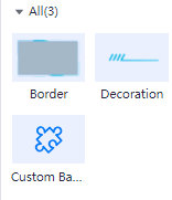
- Click the Materials icon in the navigation pane to switch to the materials component page.
Figure 1 Materials
- Drag a materials component to the canvas.
- Configure styles for the materials on the right of the page.
- Click Save and Publish or Save in the upper right corner of the page.
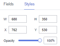
Styles
- Size/Position
- W: width of the target, in pixels.
- H: height of the target, in pixels.
- X: position of the target on the canvas, in pixels.
- Y: position of the target on the canvas, in pixels.
- Opacity: Adjust the transparency of the target on the canvas using a slider or by manually entering a percentage. A higher percentage means lower transparency.
Figure 2 Size/Position
- Border styles
- Fill
- Style: Various styles are provided for borders.
- Custom
- Image: You can set an image URL or upload a local image.
- Border Width: You can set the top, right, bottom, and left boarders to adjust the display style. The value ranges from 0 to 500.
- border-slice: You can set the top, right, bottom, and left boarders to adjust the display style. The value ranges from 0 to 500.
- Fill
- Decoration styles
- Scale Mode: The value can be Retain original image size, Proportional scaling, Cropping and Scaling, and Stretch scaling.
- Style: Various styles are provided for decorations.
- Custom Background Component
- Effect
- Background Color: Set the background color of the custom background component.
- Feathering: Set feathering for the custom background component. The value ranges from 0 to 100.
Figure 3 No feathering effect

Figure 4 Feathering effect

- Blurriness: Set blurriness for the custom background component. The value ranges from 0 to 100.
- Brightness: Set brightness for the custom background component. The value ranges from 0 to 200.
- Hue Rotation: Set hue rotation for the custom background component. The value ranges from 0 to 360.
- Opacity: Set opacity for the custom background component. The value ranges from 0 to 100.
- Borderline Options
- Style: Select the solid line, dotted line, or dotted line.
- Width: Set the width of borderlines. The value cannot be smaller than 0.
- Color: Set the color of borderlines.
- Round Corner
- Upper Left Corner: Set the upper left corner of the rounded corner. The value cannot be smaller than 0.
- Upper Right Corner: Set the upper right corner of the rounded corner. The value cannot be smaller than 0.
- Lower Right Corner: Set the lower right corner of the rounded corner. The value cannot be smaller than 0.
- Lower Left Corner: Set the lower left corner of the rounded corner. The value cannot be smaller than 0.
Figure 5 All rounded corners being 0

Figure 6 All rounded corners being 90

- Fill
- Use materials: Add preset background images to facilitate highly frequent reuse of background images.
- Custom background
- Image: You can add an image URL or upload a local image.
- Scale Mode: The value can be Retain original image size, Proportional scaling, Cropping and Scaling, and Stretch scaling.
- Image Position: The value can be Align Center, Align Left, Align Right, Top alignment, or Bottom alignment.
- Effect
Interactions
- Click Interactions. Expand Interaction Definition and click Edit interaction event. The Edit interaction page is displayed. You can add the custom background component.
Figure 7 Edit interaction

- Set Event to Click.
- Click Add Action to add an action. Actions can be changed between hidden and visible states, with different action values displayed depending on the selected widget.
- Click OK to complete the setting of the interaction event.Note
- Data filtering operators are categorized by string, number, and date types.
- String operators support exact matches, inequalities, inclusions, exclusions, prefixes, suffixes, and checks for emptiness.
- Number operators allow for equality, inequality, range comparisons, and checks for emptiness.
- Date operators support equality and range comparisons.
- Data filtering operators are categorized by string, number, and date types.
Parent topic: Large Screen Components