This section describes parameters of a pie chart.
Fields
- In the Data area on the right, select a dataset, and double-click or drag required dimension and metric fields to the corresponding areas on the Fields tab.
Table 1 Parameters on the Fields tab Parameter
Description
Field display content
Click
 in the column and click Field display content to modify the field display content on the displayed page. Click OK.
Aggregation Method
Select Aggregation Method and click to support setting of no aggregation, sum, count, distinct count, maximum value, minimum value, average value, population standard deviation, sample standard deviation, sample variance, range start value, and range end value.
- Set the color legend. Specifically, drag the required field to Color Legend.
- Set a filter.
- Find the data field you need in the dimension and metric lists within the data column.
- Click
 next to the field you wish to filter and you will be directed to the filter settings page.
 - Click OK.
Table 2 Filter parameters Type
Parameter
Description
string
Condition
Filter Mode: The options are Condition and Enumeration.
Condition Type: The options are And condition and Or condition.
Filter Condition: The options are Exact match, Contain, Start with, End with, Not match, Not contain, Null, and Not null.
Enumeration
Query Mode: The options are Single-select and multi-select.
Filter Condition: The options are >, ≥, <, ≤, =, ≠, Null, and Not null.
Metric
Condition Type
The options are And condition and Or condition.
Filter Criteria
The options are >, ≥, <, ≤, =, ≠, Null, and Not null. You can select Before aggregation and After aggregation for data.
NOTE:If you select Before aggregation, data is filtered before aggregation. If you select After aggregation, data is filtered after aggregation. For aggregation concepts, see Creating a Dataset.
You can click Create Filter Condition to set multiple filter criteria.
date
Range value
Select a time range for filtering.
Single value
Set a single time for filtering.
Condition
You can select And condition or Or condition as the condition type and select filter condition like >, ≥, <, ≤, and =.
You can click Create Filter Condition to set multiple filter criteria.
- Set sorting.
- Drag and drop required data fields from the Dimension and Metric (Indicator) areas under Data to the Sorting area.
- Click
 next to a field in the Sorting area and select a sorting mode. The sorting modes are Ascending, Descending, and Custom.
 - To cancel sorting, click
 next to the sorting field.
- Set the maximum number of query results.
Enter the maximum number of records that can be returned in the text box. The default value is 1000.
- Set automatic refresh.
The auto refresh interval supports the following options: no refresh, 1 minute, 5 minutes, 15 minutes, and 30 minutes.
Styles
This part describes the style parameters of a pie chart.
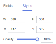
- Size/Position
- W: width of the target, in pixels.
- H: height of the target, in pixels.
- X: position of the target on the canvas, in pixels.
- Y: position of the target on the canvas, in pixels.
- Opacity: Adjust the transparency of the target on the canvas using a slider or by manually entering a percentage. A higher percentage means lower transparency.
Figure 1 Size/Position
- Global Style
Font: You can customize the font style, with the default being Microsoft YaHei.
Figure 2 Global style
- Label Attribute
- Show Label Attribute: If the checkbox is selected (
 ), label attributes are displayed. If the checkbox is not selected (
 ), label attributes are hidden.
 - Distance to Center: distance between the label and the center.
- Axis Distance: axis length of the label.
- Font Size: font size of the label.
- Color: font color of the label.
- Font Weight: font weight of the label.
- Data Name: data names of the chart. If the checkbox is selected (
 ), data names are displayed. If the checkbox is not selected (
 ), data names are hidden.
 - Display Metric Name: If the checkbox is selected, metric names are displayed. If the checkbox is not selected, metric names are hidden.
- Data Value: data values of the chart. If the checkbox is selected (), data values are displayed. If the checkbox is not selected (), data values are hidden.
- Display Proportion: If the checkbox is selected (
 ), proportions are displayed. If the checkbox is not selected (
 ), proportions are hidden.
Figure 3 Label attribute
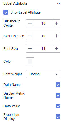
- Show Label Attribute: If the checkbox is selected (
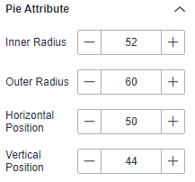
- Pie Attribute
- Inner Radius: inner radius. The value cannot be left blank and must range from 0 to 100.
- Outer Radius: outer radius. The value cannot be left blank and must range from 0 to 100.
- Horizontal Position: horizontal position. The value cannot be left blank and must range from 0 to 100.
- Vertical Position: vertical position. The value cannot be left blank and must range from 0 to 100.
Figure 4 Pie attribute
- Legend
- Show Legend: If the checkbox is selected (
 ), legends are displayed. If the checkbox is not selected (
 ), legends are hidden.
 - Display Metric Name: whether to display the metric name.
- Data Value: whether to display data value.
- Proportion Display: whether to display the proportion.
- Text: text style of the legend, including Font Size, Color, and Font Weight.
- Layout: You can set the direction, position, left and right spacing, top and bottom spacing, and legend spacing.
- Legend Mark: You can set the mark type, width, and height.
Figure 5 Legend
- Show Legend: If the checkbox is selected (
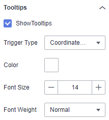
- Tooltips
- Show Tooltips: If the checkbox is selected (
 ), a tooltip is displayed when you preview or view a published component. If the checkbox is not selected (
 ), no tooltip is displayed when you preview or view a published component.
 - Data Name: whether to display the data name.
- Color: font color of the tooltips.
- Font Size: font size of tooltips.
- Font Weight: font weight of tooltips.
Figure 6 Tooltips
- Show Tooltips: If the checkbox is selected (
- Animation
- Show Animation: If the checkbox is selected (
 ), animations are displayed. If the checkbox is not selected (
 ), animations are not displayed.
 - Intro Animation Duration (ms): duration of the first rendering of the component, in ms.
- Animation Effect: The system provides multiple common animation slow-moving effects.
- Update Duration (ms): animation duration when the component data is updated, in ms.
- Start from Previous Position: If this option is selected, the animation is played from the position of the previous data when the component data is updated. If this option is deselected, the animation is played from the initial position when the component data is updated.
- Show Animation: If the checkbox is selected (
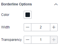
- Borderline Options
- Color: color of the borderline.
- Width: width of the borderline. The value cannot be left blank and must range from 0 to 10.
- Transparency: transparency of the borderline. Note that the value cannot be left blank and must range from 0 to 1.
Figure 7 Borderline options
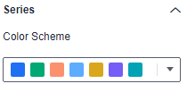
- Series
- Color Scheme: Supports default, classic, comfort, intelligence, data, art, and SaaS specifications color schemes.
Figure 8 Color scheme
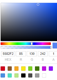
- Series: You can set the colors of the series.
Figure 9 Series color configuration
- Color Scheme: Supports default, classic, comfort, intelligence, data, art, and SaaS specifications color schemes.
Interactions
- Linkage
- Choose Advanced > Link. The Chart Linkage Configuration page is displayed. Set parameters by referring to Table 3.
Table 3 Chart linkage configurations Parameter
Description
Filter
Select the fields to be bound first and then select the charts to be associated. You can select the two-dimensional charts on the screen.
- Click Filter. The Filter tab is displayed.
- Click
 next to Fields to Bound. The associated field box is displayed.
 - Click
 , select the field to be bound, and select the associated chart.
Shown/Hidden
Select the required fields first and then select the charts to be associated. You can select all charts on the screen.
- Click Show/Hidden. The Shown/Hidden tab is displayed.
- Select the associated chart.
- Click OK.
- Choose Advanced > Link. The Chart Linkage Configuration page is displayed. Set parameters by referring to Table 3.
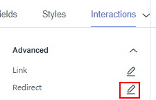
- Redirect
- Click Interactions.
- Choose Advanced > Redirect. The chart redirection page is displayed.
Figure 10 Interactions tab
- Click
 next to Fields to Bound. The associated field box is displayed.
 - Click
 and select the field to be bound.
 - Set Redirect Type, Open Mode, Redirect to Reports/Screens, and Associated Parameters, and click OK. Note
- You can also redirect with parameters.
- To ensure successful redirection, set the fields on the Field tab if the chart requires it, and then proceed to set the bound fields on the chart redirection page.
Table 4 Parameters Parameter
Description
Redirect Type
Intra-system redirect: Redirect to the internal screen and dashboard projects.
External redirect: Redirect to external URLs not contained within the software.
Open Mode
Open in this window: After you click the chart with redirection set, the target chart is opened in the current window.
Open in new window: After you click the chart with redirection set, the target chart is opened in a new window.
Open in popup window: After you click the chart with redirection set, the target chart is opened as a pop-up window. The size of the pop-up window is customizable.
Redirect to Reports/Screens
- Select a project first.
- Select a dashboard/screen.NOTE:
This step is mandatory when Redirect Type is set to Intra-system redirect.
Associated Parameters
Set Effective Parameters of This Screen.
- Associated Parameters: Carry associated fields to the chart that you are redirecting to.
- Enter a fixed value: The chart that you redirect to only filters the fixed value. For example, if the fixed value is set to city, the chart that you redirect to displays the filtered city field.
- Control Variables: Each value selected in the drop-down box, search, or tab list is a variable value set by the control variable. For example, if you select city in the drop-down box, the variable value of the control variable is city, and the chart that you redirect to filters out the city field.
- Global Parameters: Carry the values in the global variables to the chart that you redirect to.
Carry Condition
When Redirect Type is Intra-system redirect, null values can be carried. Carrying null values is mainly used for filtering null values in data tables, making it easier for users to analyze data.
- Prerequisites: Set up two large screens, A and B, with screen A linking to screen B.
- Procedure
- Configure global parameters in screen B and ensure that the same fields exist in screen A.
- Set the redirect parameters in screen A, select screen B as the target, and choose associated fields from the global parameters.
- Select Carry null value and click OK.
- The bound field in screen A will be underlined. Click it to redirect to screen B and filter out rows with null fields. The URL of screen B will display the param parameter.
- Deselect Carry null value and click OK.
- The bound field in screen A will be underlined. Click it to redirect to screen B and display all chart data. The URL of screen B will not display the param parameter.
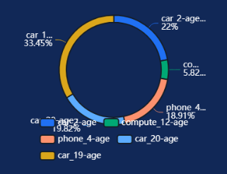
Chart Display
Figure 11 Pie chart