If you need multiple controls to display a set of data together and form a larger control for display, the composite container supports data analysis in this scenario.
Prerequisites
You have subscribed to DataArts Insight.
Procedure
- In the top navigation bar on the dashboard creation page, click
 to create a composite container.
 - Set the composite container parameters based on Table 1.
Table 1 Composite container parameters Parameter
Description
Card Title
Cards can be configured with or without a title. If a title is set, it will be displayed in the top left corner of the card.
If the checkbox is not selected (
 ), the card will have no title.
If the checkbox is selected (
 ), the card will have a title.
Text
You can adjust the font size and color of the text. To change the font size, you can either type in the desired size or use the
 and
and  buttons.
Alignment
You can align the text in the card to the left or center.
Bottom Margin
Set the distance between the composite container title and the chart. To change the margin, you can either type in the desired margin or use the
and buttons.Divider
Cards can be configured with or without a divider line.
If the checkbox is not selected (
 ), the card will have no divider line.
If the checkbox is selected (
 ), the card will have a divider line. You can customize the style and bottom margin of the divider line. The style and bottom margin can be set by inputting values or using the
  and
and  buttons.
Card Background
Cards can be configured with or without a background.
If the checkbox is not selected (
 ), the card will have no background.
If the checkbox is selected (
 ), the card will have a background. The background color can be set.
Status Icon
You can customize the display style and color of the icon, which can be set to always show or show on hover. The card icon can be set to have a status or no status.
If the checkbox is not selected (
 ), the icon will have no status.
If the checkbox is selected (
 ), the icon will have a status.
Show Line
You can choose whether or not to display lines, and if displayed, whether to show a right arrow or no arrow. A line can act like flowchart lines, connecting the controls within the container.
Do not display lines: When the checkbox is not selected (
 ), lines are not displayed.
Display lines: When the checkbox is selected (
 ), lines are displayed.
Type
The following line types are supported: --, -------, and .........
Show Line
Set the number of lines to be displayed either by entering a specific value or using the
 and
and  buttons.
 - Select the visual controls you need from the dashboard navigation bar.
- Select the desired control. If the newly added control overlaps with the existing one, drag and drop it to another area using the mouse.
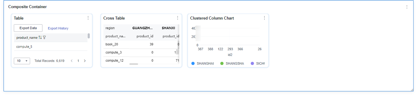
Figure 1 Composite container
- Click Save or Save and Publish in the upper right corner to save the dashboard composed of the composite container.Note
The differences between Save and Save and Publish are as follows:
- Click Save in the upper right corner. In the displayed dialog box, enter the dashboard name, and click Confirm. The saved dashboard cannot be viewed but can be deleted.
- Click Save and Publish to save and publish the dashboard. You can view the saved dashboard. To delete the dashboard, you need to take it offline first.
- On the displayed dashboard page, enter a dashboard name.