This section describes parameters of a carousel table component.
Fields
- In the Data area on the right, select a dataset, and double-click or drag required dimension and metric fields to the corresponding areas on the Fields tab.
- Set a filter.
- Find the data field you need in the dimension and metric lists within the data column.
- Click
 next to the field you wish to filter and you will be directed to the filter settings page.
 - Click OK.
Table 1 Filter parameters Type
Parameter
Description
string
Condition
Filter Mode: The options are Condition and Enumeration.
Condition Type: The options are And condition and Or condition.
Filter Condition: The options are Exact match, Contain, Start with, End with, Not match, Not contain, Null, and Not null.
Enumeration
Query Mode: The options are Single-select and multi-select.
Filter Condition: The options are >, ≥, <, ≤, =, ≠, Null, and Not null.
Metric
Condition Type
The options are And condition and Or condition.
Filter Condition
The options are >, ≥, <, ≤, =, ≠, Null, and Not null. You can select Before aggregation and After aggregation for data.
NOTE:If you select Before aggregation, data is filtered before aggregation. If you select After aggregation, data is filtered after aggregation. For aggregation concepts, see Creating a Dataset.
You can click Create Filter Condition to set multiple filter criteria.
Date
Range value
Select a time range for filtering.
Single value
Set a single time for filtering.
Condition
You can select And condition or Or condition as the condition type and select filter condition like >, ≥, <, ≤, and =.
You can click Create Filter Condition to set multiple filter criteria.
- Set sorting.
- Drag and drop required data fields from the Dimension and Metric (Indicator) areas under Data to the Sorting area.
- Click
 next to a field in the Sorting area and select a sorting mode. The sorting modes are Ascending, Descending, and Custom.
 - To cancel sorting, click
 next to the sorting field.
- Set the maximum number of query results.
Enter the maximum number of records that can be returned in the text box. The default value is 1000.
- Set automatic refresh.
The auto refresh interval supports the following options: no refresh, 1 minute, 5 minutes, 15 minutes, and 30 minutes.
Styles
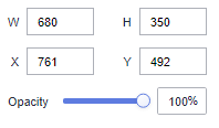
- Size/Position
- W: width of the target, in pixels.
- H: height of the target, in pixels.
- X: position of the target on the canvas, in pixels.
- Y: position of the target on the canvas, in pixels.
- Opacity: Adjust the transparency of the target on the canvas using a slider or by manually entering a percentage. A higher percentage means lower transparency.
Figure 1 Size/Position
- Global Style
- Rows: Enter a value to set the number of rows to be displayed in the table.
- Carousel: Select this option to show table content in rotation. If not selected, the table content remains static. If the table has more rows than the specified limit, a scroll bar appears for viewing.
- Animation Type: Select an animation type. The value can be Flipping, Marquee, or Bouncing.
- Interval: Enter a value or click the buttons to set the interval for rotating the table content.
- Borderline: Set the width and color of the borderline.
- Table Header
- ShowTable Header: Select this to show the table header.
- Header Row Height: Enter a value to set the row height of the table header.
- Background Color: Select a background color.
- Alignment: Select the alignment mode of the text in the table header. The value can be Center Horizontally, Left, or Right.
- Text
- Font: Select a font.
- Font Color: Select a font color.
- Font Size: Select a font size.
- Font Weight: Select a font width.
- Row Configuration
- Row Height: Set the row height. The value cannot be less than 45.
- Background Color of Odd-Numbered Row: Select a background color for odd-numbered rows.
- Background Color of Even-Numbered Row: Select a background color for even-numbered rows.
- Text: This area contains parameters about the font size, color, and weight.
- Row Divider
- Style: Select the style of the line divider. The options are Solid, Dashed, and Dotted.
- Weight: Enter a value to set the thickness of the row divider.
- Row Color: Select a color for the row divider.
- Sequence Number
- ShowSequence Number: Select this to show the sequence number (SN).
- Background Color: Select a background color.
- Round Corner: Enter a value or click the buttons to set the round corner angle of the SN icon.
- Column Width Ratio (%): Enter a value or click the buttons to set the width of the SN column.
- Radius: Enter a value to set the radius size.
- Font Color: Select the font color.
- Font Size: Enter a value or click the buttons to set the font size.
- Font Weight: Select the font width of the text in the SN column.
Interactions
This part describes the interaction parameters of the carousel table component.
- Click Interactions.
- Expand Interaction Definition and click Edit interaction event.
Figure 2 Edit interaction
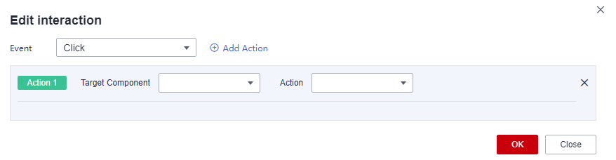
- Set Event to Click.
- Click Add Action to add an action. Actions can be changed between hidden and visible states, with different action values displayed depending on the selected widget.
- Click OK to complete the setting of the interaction event.Note
- Data filtering operators are categorized by string, number, and date types.
- String operators support exact matches, inequalities, inclusions, exclusions, prefixes, suffixes, and checks for emptiness.
- Number operators allow for equality, inequality, range comparisons, and checks for emptiness.
- Date operators support equality and range comparisons.
- Data filtering operators are categorized by string, number, and date types.