This section describes parameters of a table component.
Fields
- In the Data area on the right, select a dataset, and double-click or drag required dimension and metric fields to the corresponding areas on the Fields tab.
- Set a filter.
- Find the data field you need in the dimension and metric lists within the data column.
- Click
 next to the field you wish to filter and you will be directed to the filter settings page.
 - Click OK.
Table 1 Filter parameters Type
Parameter
Description
string
Condition
Filter Mode: The options are Condition and Enumeration.
Condition Type: The options are And condition and Or condition.
Filter Condition: The options are Exact match, Contain, Start with, End with, Not match, Not contain, Null, and Not null.
Enumeration
Query Mode: The options are Single-select and multi-select.
Filter Condition: The options are >, ≥, <, ≤, =, ≠, Null, and Not null.
Metric
Condition Type
The options are And condition and Or condition.
Filter Condition
The options are >, ≥, <, ≤, =, ≠, Null, and Not null. You can select Before aggregation and After aggregation for data.
NOTE:If you select Before aggregation, data is filtered before aggregation. If you select After aggregation, data is filtered after aggregation. For aggregation concepts, see Creating a Dataset.
You can click Create Filter Condition to set multiple filter criteria.
Date
Range value
Select a time range for filtering.
Single value
Set a single time for filtering.
Condition
You can select And condition or Or condition as the condition type and select filter condition like >, ≥, <, ≤, and =.
You can click Create Filter Condition to set multiple filter criteria.
- Set sorting.
- Drag and drop required data fields from the Dimension and Metric (Indicator) areas under Data to the Sorting area.
- Click
 next to a field in the Sorting area and select a sorting mode. The sorting modes are Ascending, Descending, and Custom.
 - To cancel sorting, click
 next to the sorting field.
- Set the maximum number of query results.
Enter the maximum number of records that can be returned in the text box. The default value is 1000.
- Set automatic refresh.
The auto refresh interval supports the following options: no refresh, 1 minute, 5 minutes, 15 minutes, and 30 minutes.
Styles
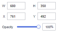
- Size/Position
- W: width of the target, in pixels.
- H: height of the target, in pixels.
- X: position of the target on the canvas, in pixels.
- Y: position of the target on the canvas, in pixels.
- Opacity: Adjust the transparency of the target on the canvas using a slider or by manually entering a percentage. A higher percentage means lower transparency.
Figure 1 Size/Position
- Global Style
- Table Layout: Choose a table layout adjustment method. The options are Automatic adjustment and Proportion adjustment.
- Pagination Display: Select this to further set the number of rows, font type, font color, font size, and font width for the table.
- Filter: Select this to add
 to the table, facilitating data filtering.
 - Sort: Select this to add the sorting icon on the table header.Note
- Sorting by dimension: Drag and drop dimension fields into the sorting slots to display them in the chart.
- Sorting by metric: Metric fields in the sorting slots are not displayed in the chart by default. To display them, drag and drop them into the metric slots.
- Borderline: Set the width and color of the table borderline.
- Table Header
- ShowTable Header: Select this to show the table header.
- Header Row Height: Enter a value to set the row height of the table header.
- Background Color: Select a background color.
- Alignment: Select the alignment mode of the text in the table header. The value can be Center Horizontally, Left, or Right.
- Font: Select a font for the table header.
- Font Color: Select a font color for the table header.
- Font Size: Select a font size for the table header.
- Font Weight: Select a font width for the table header.
- Row Configuration
- Row Height: Set the row height. The value cannot be less than 45.
- Background Color of Odd-Numbered Row: Select a background color for odd-numbered rows.
- Background Color of Even-Numbered Row: Select a background color for even-numbered rows.
- Background Color of Selected Row: Select a background color for the specified rows.
- Alignment: Select the alignment method. The options include Center Horizontally, Left, and Right.
- Automatic Line Break: Select this to enable line-wrapping.
- Text: You can select the font type, color, size, and weight.
- Row Divider
- Style: Select the style of the line divider. The options are Solid, Dashed, and Dotted.
- Weight: Enter a value to set the thickness of the row divider.
- Row Color: Select a color for the row divider.
- Series Settings: You can configure the alignment of table headers and column content independently.
- Select Series: Select a column item according to your needs.
- Natural Alignment: Select this to enable alignment settings for both table headers and content.
- Header alignment: Set the alignment of table headers. Alignment options include automatic, left-aligned, center-aligned, and right-aligned.
- Content alignment: Set the alignment of column content. Alignment options include automatic, left-aligned, center-aligned, and right-aligned.
- Condition Format
Table 2 Parameters Parameter
Description
Condition Format
Select Series: Select configuration fields based on the fields displayed in the chart.
Quick style.
- Select a quick icon from the existing styles.
- Color inversion: Turn on color inversion to swap the colors of the quick icon. Turn it off to restore the original colors.
Custom style:
- Text
- Condition selection: Choose between comparing with a fixed value or a dynamic value.
- Filter Condition Types: Includes greater than, greater than or equal to, equal to, less than or equal to, less than, not equal to, greater than A and less than or equal to B, greater than or equal to A and less than B, greater than A and less than B, greater than or equal to A and less than or equal to B. Fixed comparison values can be customized, while dynamic field comparison values are system-selected.
- Color Scheme: After setting the filter conditions, click the color button to customize the color.
- Add Rule: Click + to add a filter condition.
- Delete: Click - to delete a filter condition.
- Icon
- Condition selection: Choose between comparing with a fixed value or a dynamic value.
- Icon Style: Choose from pre-selected icons or set a custom icon after the filter conditions.
- Filter Condition Types: Includes greater than, greater than or equal to, equal to, less than or equal to, less than, not equal to, greater than A and less than or equal to B, greater than or equal to A and less than B, greater than A and less than B, greater than or equal to A and less than or equal to B. Fixed comparison values can be customized, while dynamic field comparison values are system-selected.
- Add Rule: Click + to add a filter condition.
- Delete: Click - to delete a filter condition.