This section describes parameters of a bar chart.
Fields
- In the Data area on the right, select a dataset, and double-click or drag required dimension and metric fields to the corresponding areas on the Fields tab.
Table 1 Parameters on the Fields tab Parameter
Description
Field display content
Click
 in the column and click Field display content to modify the field display content on the displayed page. Click OK.
Aggregation Mode
Select Aggregation Method and click to support setting of no aggregation, sum, count, distinct count, maximum value, minimum value, average value, population standard deviation, sample standard deviation, sample variance, range start value, and range end value.
- Set the color legend. Specifically, drag the required field to Color Legend.
- Set a filter.
- Find the data field you need in the dimension and metric lists within the data column.
- Click
 next to the field you wish to filter and you will be directed to the filter settings page.
 - Click OK.
Table 2 Filter parameters Type
Parameter
Description
string
Condition
Filter Mode: The options are Condition and Enumeration.
Condition Type: The options are And condition and Or condition.
Filter Condition: The options are Exact match, Contain, Start with, End with, Not match, Not contain, Null, and Not null.
Enumeration
Query Mode: The options are Single-select and multi-select.
Filter Condition: The options are >, ≥, <, ≤, =, ≠, Null, and Not null.
Metric
Condition Type
The options are And condition and Or condition.
Filter Condition
The options are >, ≥, <, ≤, =, ≠, Null, and Not null. You can select Before aggregation and After aggregation for data.
NOTE:If you select Before aggregation, data is filtered before aggregation. If you select After aggregation, data is filtered after aggregation. For aggregation concepts, see Creating a Dataset.
You can click Create Filter Condition to set multiple filter criteria.
Date
Range value
Select a time range for filtering.
Single value
Set a single time for filtering.
Condition
You can select And condition or Or condition as the condition type and select filter condition like >, ≥, <, ≤, and =.
You can click Create Filter Condition to set multiple filter criteria.
- Set sorting.
- Drag and drop required data fields from the Dimension and Metric (Indicator) areas under Data to the Sorting area.
- Click
 next to a field in the Sorting area and select a sorting mode. The sorting modes are Ascending, Descending, and Custom.
 - To cancel sorting, click
 next to the sorting field.
- Set the maximum number of query results.
Enter the maximum number of records that can be returned in the text box. The default value is 1000.
- Set automatic refresh.
The auto refresh interval supports the following options: no refresh, 1 minute, 5 minutes, 15 minutes, and 30 minutes.
Style
This part describes the style parameters of a bar chart.
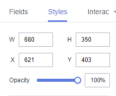
- Size/Position
- W: width of the target, in pixels.
- H: height of the target, in pixels.
- X: position of the target on the canvas, in pixels.
- Y: position of the target on the canvas, in pixels.
- Opacity: Adjust the transparency of the target on the canvas using a slider or by manually entering a percentage. A higher percentage means lower transparency.
Figure 1 Size/Position
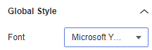
- Global Style
- Font: font of the text in the chart.
Figure 2 Global style
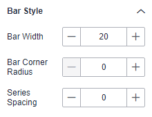
- Bar Style
- Bar Width: bar width, which can be adjusted by entering a numerical value or clicking - or +. Note that the input cannot be empty and must be from 1 to 100.
- Bar Corner Radius: bar corner radius, which can be adjusted by entering a numerical value or clicking - or +. Note that the input cannot be empty and must be from 0 to 100.
- Series Spacing: series spacing, which can be adjusted by entering a numerical value or clicking - or +. Note that the input cannot be empty and must be from –100 to 100.
Figure 3 Bar style
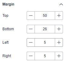
- Margin
- Top: The spacing between the chart and the top of the layer, which can be adjusted by entering a numerical value or clicking - or +.
- Bottom: The spacing between the chart and the bottom of the layer, which can be adjusted by entering a numerical value or clicking - or +.
- Left: The spacing between the chart and the left of the layer, which can be adjusted by entering a numerical value or clicking - or +.
- Right: The spacing between the chart and the right of the layer, which can be adjusted by entering a numerical value or clicking - or +.
Figure 4 Margin
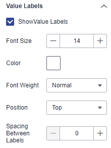
- Value Labels
- Show Value Labels: If the checkbox is selected (
 ), value labels are displayed. If the checkbox is not selected (
 ), value labels are not displayed.
 - Font Size: font size of the value label.
- Color: color of the value label.
- Font Weight: font weight of the value label.
- Position: position of the value label.
- Spacing Between Labels: spacing between labels above the bar chart.
Figure 5 Value labels
- Show Value Labels: If the checkbox is selected (
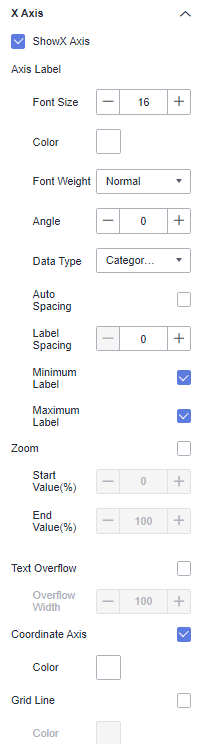
- X Axis
- Show X Axis: If the checkbox is selected (
 ), the X axis is displayed. If the checkbox is not selected (
 ), the X axis is not displayed.
 - Axis Label: You can set the font size, color, font weight, and angle.
- Data Type: data type of the X axis. The options are Numeric, Category, and Time.
- Auto Spacing: whether to enable automatic spacing.
- Label Spacing: number of spaces between labels.
- Minimum Label: whether to support the minimum label.
- Maximum Label: whether to support the maximum label.
- Zoom: whether to enable zooming.
- Text Overflow: whether to allow text overflow. The overflow width can be set.
- Coordinate Axis: color of the X axis.
- Grid Line: If the checkbox is selected (
 ), grid lines of the X axis are displayed. If the checkbox is not selected (
 ), grid lines of the X axis are not displayed.
Figure 6 X axis
- Show X Axis: If the checkbox is selected (
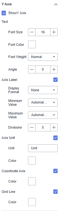
- Y Axis
- Show Y Axis: If the checkbox is selected (), the Y axis is displayed. If the checkbox is not selected (), the Y axis is not displayed.
- Text: You can set the font size, font color, font weight, and angle.
- Axis Label: You can set the display format, minimum value, maximum value, and number of divisions.
- Axis Unit: whether to display the axis unit. The unit color and unit name can be set.
- Coordinate Axis: color of the Y axis.
- Grid Line: If the checkbox is selected (), grid lines of the Y axis are displayed. If the checkbox is not selected (), grid lines of the Y axis are not displayed.
Figure 7 Y Axis
- Show Y Axis: If the checkbox is selected (
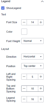
- Legend
- Show Legend: If the checkbox is selected (
 ), legends are displayed. If the checkbox is not selected (
 ), legends are hidden.
 - Text: text style of the legend, including Font Size, Color, and Font Weight.
- Layout: You can set the legend direction, position, left/right spacing, top/bottom spacing, and legend spacing.
Figure 8 Legend
- Show Legend: If the checkbox is selected (
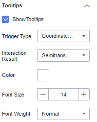
- Tooltips
- Show Tooltips: If the checkbox is selected (
 ), a tooltip is displayed when you preview or view a published component. If the checkbox is not selected (
 ), no tooltip is displayed when you preview or view a published component.
 - Trigger Type: The options include Data Item and Coordinate Axis.
- Interaction Result: The options include Semitransparent and Zoom In.
- Color: font color of the tooltips.
- Font Size: font size of tooltips.
- Font Weight: font weight of tooltips.
Figure 9 Tooltips
- Show Tooltips: If the checkbox is selected (
- Animation
- Show Animation: If the checkbox is selected (
 ), animations are displayed. If the checkbox is not selected (
 ), animations are not displayed.
 - Intro Animation Duration (ms): duration of the first rendering of the component, in ms.
- Animation Effect: The system provides multiple common animation slow-moving effects.
- Update Duration (ms): animation duration when the component data is updated, in ms.
- Start from Previous Position: If this option is selected, the animation is played from the position of the previous data when the component data is updated. If this option is deselected, the animation is played from the initial position when the component data is updated.
- Show Animation: If the checkbox is selected (
- Series to Category
- Show Series to Category: whether to support the display of series to categories.
- Value Settings: You can set the context, units, scientific notation, use of thousand separators, and decimal places for numerical values.
- Condition Format
- Select fields you need to configure.
- Condition selection: Choose between comparing with a fixed value or a dynamic value.
- Filter Condition Types: Includes greater than, greater than or equal to, equal to, less than or equal to, less than, not equal to, greater than A and less than or equal to B, greater than or equal to A and less than B, greater than A and less than B, greater than or equal to A and less than or equal to B. Fixed comparison values can be customized, while dynamic field comparison values are system-selected.
- Color Scheme: After setting the filter conditions, click the color button to customize the color.
- Add Rule: Click + to add a filter condition.
- Delete: Click - to delete a filter condition.
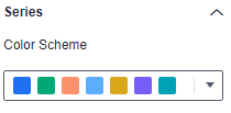
- Series
- Color Scheme: Supports default, classic, comfort, intelligence, data, art, and SaaS specifications color schemes.
Figure 10 Color Scheme
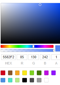
- Series: Supports configuration of series colors (solid and gradient colors).
Gradient colors can be set with start and end colors, and the start and end colors can also be swapped.
Figure 11 Series color configuration
- Color Scheme: Supports default, classic, comfort, intelligence, data, art, and SaaS specifications color schemes.
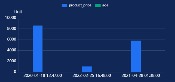
Chart Display
Figure 12 Example of a bar chart