A Sankey chart can display the flow of data from one group to another, with the width of the branches representing the size of the data flow. This section describes how to create a Sankey chart.
Notes and Constraints
- You must drag at least two fields and can drag up to 20 fields to the Dimension area.
- You can only drag one field to the Metric area.
Prerequisites
- A project has been created by referring to Creating a Project.
- A data source has been connected by referring to Creating a Data Source.
- A dataset has been created by referring to Creating a Dataset.
- A dashboard has been created by referring to Creating a Dashboard.
Procedure
- In the top navigation bar on the dashboard creation page, click Add Chart and choose Other > Sankey to create a Sankey chart.
- Select a dataset in the Data area.
- Set parameters on the Field and Style tabs.
- Click Update. The system automatically updates the chart.
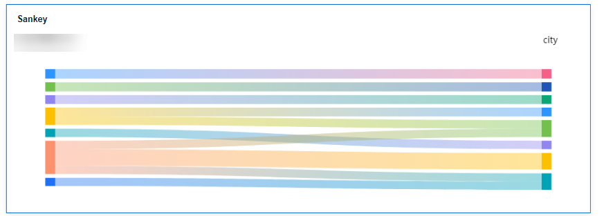
Figure 1 Sankey chart
Field
- Find the data field you need in the dimension and metric lists within the data column.
- In the dimension list, select the field and drag it to the column.
- In the metric list, select the field and drag it to the column.
Columns support the setting of field display content modification for dimension fields.
- Set the field display content.
Click
 in the column, select Field Display Content and click to modify the field display content on the displayed page. Click OK.Note
Aggregation method: Perform calculation and processing on data to make the analyzed data more orderly and intuitive.
- Set the aggregation mode.
Click
 of the field in the column, select Aggregation Method and click to support setting of no aggregation, sum, count, distinct count, maximum value, minimum value, average value, population standard deviation, sample standard deviation, sample variance, range start value, and range end value.
 - Set the field display content.
Click
 in the column, select Field Display Content and click to modify the field display content on the displayed page. Click OK.
- Set a filter.
- Drag dimension and metric fields to the Filter area.
- Click
 next to a field in the Filter area.
 - In the displayed Set Filter dialog box, set the parameters and click OK.
Table 1 Filter parameters Type
Parameter
Description
String
Condition
Filter Mode: The options are Condition and Enumeration.
Condition Type: The options are And condition and Or condition.
Filter Condition: The options are Exact match, Contain, Start with, End with, Not match, Not contain, Null, and Not null.
Enumeration
Query Mode: The options are Single-select and multi-select.
Filter Condition: The options are >, ≥, <, ≤, =, ≠, Null, and Not null.
Metric
Condition Type
The options are And condition and Or condition.
Filter Condition
The options are >, ≥, <, ≤, =, ≠, Null, and Not null. You can select Before aggregation and After aggregation for data.
NOTE:If you select Before aggregation, data is filtered before aggregation. If you select After aggregation, data is filtered after aggregation. For aggregation concepts, see Creating a Dataset.
You can click Create Filter Condition to set multiple filter criteria.
Date
Range value
Select a time range for filtering.
Single value
Set a single time for filtering.
Condition
You can select And condition or Or condition as the condition type and select filter condition like >, ≥, <, ≤, and =.
You can click Create Filter Condition to set multiple filter criteria.
- Set sorting.
- Drag and drop required data fields from the Dimension and Metric (Indicator) areas under Data to the Sorting area.
- Click
 next to a field in the Sorting area and select a sorting mode. The sorting modes are Ascending, Descending, and Custom.
 - To cancel sorting, click
 next to the sorting field.
- Set the maximum number of query results.
Enter the maximum number of records that can be returned in the text box. The default value is 1000.
- Set automatic refresh.
The auto refresh interval supports the following options: no refresh, 1 minute, 5 minutes, 15 minutes, and 30 minutes.
Style
Set Sankey chart style parameters.
- Basic settings
Table 2 Basic settings Parameter
Description
Card Title
Cards can be configured with or without a title. If a title is set, it will be displayed in the top left corner of the card.
If the checkbox is not selected (
 ), the card will have no title.
If the checkbox is selected (
 ), the card will have a title.
Text
You can adjust the font size and color of the text. To change the font size, you can either type in the desired size or use the
 and
and  buttons.NOTE:
Note that the input cannot be empty and must be from 14 to 32.
Alignment
You can align the text in the card to the left or center.
Bottom Margin
Set the distance between the Sankey chart title and the chart. To change the margin, you can either type in the desired margin or use the
and buttons.NOTE:Note that the input cannot be empty and must be from 0 to 32.
Divider
Cards can be configured with or without a divider line.
If the checkbox is not selected (
 ), the card will have no divider line.
If the checkbox is selected (
 ), the card will have a divider line. You can customize the style and bottom margin of the divider line. The style and bottom margin can be set by inputting values or using the
  and
and  buttons.NOTE:
Note that the input for the style cannot be empty and must be from 0 to 8. The bottom margin can only be set after the style has been set, and the input cannot be empty and must be from 0 to 32.
Card Background
Cards can be configured with or without a background.
If the checkbox is not selected (
 ), the card will have no background.
If the checkbox is selected (
 ), the card will have a background. You can customize the background color.
Status Icon
You can customize the display style and color of the icon, which can be set to always show or show on hover. The card icon can be set to have a status or no status.
If the checkbox is not selected (
 ), the icon will have no status.
If the checkbox is selected (
 ), the icon will have a status.
 - Chart Style
- Visualization Style
- Colors provided by the system are supported.
- Sorting options include default, ascending node height, and descending node height.
- Empty values for outgoing data can be displayed as nodes or as lost flows.
- You can customize the width and spacing of nodes.
- You can set line type, color, and transparency for data flows.
- Line types include curve and straight.
- Line color options include fixed, gradient at both ends, follow the starting node, and follow the ending node.
- Visualization Style
- Labels
- Data labels support full, dimension, and metric settings.
- Full: Supports displaying dimension and metric data.
- Dimension: When selected, the chart displays dimension data. When not selected, dimension data is not displayed. The value ranges from 12 to 32, and the color can be customized by the user.
- Metric: When selected, the chart displays metric data. When not selected, metric data is not displayed. The value ranges from 12 to 32, and the color can be customized by the user.
- Arrangement: The display order of dimension and metric data in the chart, respectively, is left/right and top/bottm.
- Class Labels
- Position: Class labels can be displayed above or below the chart.
- The spacing between the labels and the image can be customized by the user.
- Text: The size and color of class labels can be customized by the user, with a size range of 12–23.
- Data labels support full, dimension, and metric settings.
- Series Settings: You can select fields to set the node style and label text.
- Node styles support bar charts.
- Label text: Supports dimension and metric font size and color settings, with a font size range of 12–32.
- Tooltips: When the mouse hovers over the chart, a tooltip appears.
- Supports displaying or not displaying tooltips in the chart.
- Text: Supports setting the font size and color of the tooltip text, with a font size range of 12–32.
- Background: Supports user-defined tooltip background color settings.