Intelligent charts can help you present data analysis results in a clear and intuitive way. This section introduces different types of charts and their use cases, as well as the chart types supported by different editions, to assist you in quickly selecting the appropriate chart for data presentation and display.
DataArts Insight provides a variety of chart styles, such as tables, line and plane charts, bar and rank charts, and indicator charts, to meet your flexible and visual analysis requirements. The current report is displayed by default on the dashboard.
Use Cases
Each chart has its use cases and data elements (fields that form the chart). The following describes the use cases, data elements, and examples of various charts.
Type | Chart | Description | Data Element |
|---|---|---|---|
Table | Table | Tables are primarily used to perform dimension-based metric data statistics or detailed data displays, and to merge and aggregate similar data. | Column |
Line/Plane chart | Line chart | Line charts are used to display the trend of data over equal time intervals. | Dimension Metric Color legend |
Area chart | Area charts are used to display the trend of data over a certain period of time, as well as the proportion of each indicator's area. | Dimension Metric Color legend | |
Stacked area chart | Similar to area charts, the difference with stacked area charts is that the starting point of each data set is based on the previous data set, showing the trend line of each value's size change over time or category, displaying the relationship between parts and the whole. | Dimension Metric Color legend | |
Line chart and clustered column chart | Line and clustered column charts support dual-axis display of data with different magnitudes, and support data display scenarios for conventional line and column chart combinations.
| Dimension Metric Color legend | |
Column/Bar chart | Clustered column chart | Bar charts are useful for comparing differences between data groups and displaying changes in data over a period of time. | Dimension Metric Color legend |
Stacked column chart | A stacked column chart is an effective way to show data for each sub-class within a class, as well as the proportion of each sub-class. This helps to illustrate the relationship between a specific project and the overall data. | Dimension Metric Color legend | |
Indicator chart | Indicator dashboard | An indicator dashboard can display data in a clear and concise manner, allowing you to quickly grasp the current situation and make timely decisions to implement appropriate measures. | Dimension Metric |
Prerequisites
- A project has been created by referring to Creating a Project.
- A data source has been connected by referring to Creating a Data Source.
- A dataset has been created by referring to Creating a Dataset.
- A dashboard has been created by referring to Creating a Dashboard.
Notes and Constraints
- Select at least one data field for the Column area.
Procedure
- In the top navigation bar on the dashboard creation page, click
 to create an intelligent chart.
 - Select a dataset in the Data area.
- Set parameters on the Field, Style, and Advanced tabs.
- Click Update. The system automatically updates the chart.
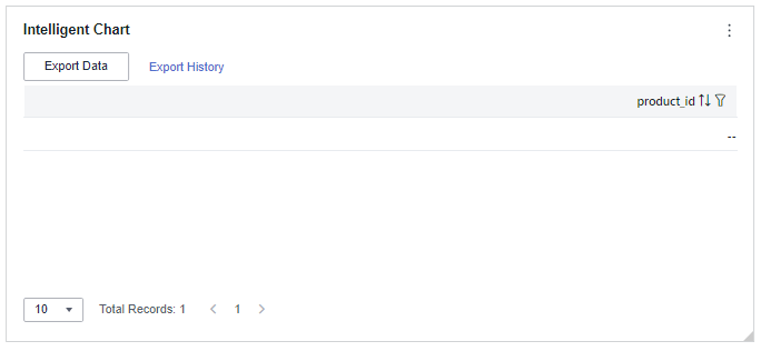
Figure 1 Intelligent chart
- Click Save or Save and Publish in the upper right corner to save the dashboard.
- In the displayed Dashboard dialog box, set Name and click Confirm.
Field
This part describes the field configuration of intelligent charts.
- Set the column content.
- In the dimension list in the data column, select the field and double-click or drag it to the field column.
- In the metric list in the data column, select the field and double-click or drag it to the field column.
- Set the field display content.
Click
 in the column, select Field Display Content and click to modify the field display content on the displayed page. Click OK.
 - Set the drill-down.
Columns support the setting of field display content modification and drill-down functions for dimension fields.
NoteDrill-down function: When analyzing company sales data, you can change the analysis granularity by drilling down the data, such as drilling down from the regional granularity to the provincial granularity to view the data situation based on geographic dimensions. Connecting data from various dimensions facilitates data analysts to analyze the data and draw conclusions.
- Click the field (
 ) in the column and drag the field of the target location to be drilled down to the Drilldown area.
 - Click Update to test whether the drilldown function is set successfully.
- Click the field (
- Set the aggregation mode.
Columns support the setting of aggregation method and field display content for metric fields.
NoteAggregation method: Perform calculation and processing on data to make the analyzed data more orderly and intuitive.
Click
 in the column, select Aggregation Method and click to support setting of no aggregation, sum, count, distinct count, maximum value, minimum value, average value, population standard deviation, sample standard deviation, and sample variance.
 - Set the field display content.
Click
 in the column, select Field Display Content and click to modify the field display content on the displayed page. Click OK.
- Set a filter.
- Drag dimension and metric fields to the Filter area.
- Click
 next to a field in the Filter area.
 - In the displayed Set Filter dialog box, set the parameters and click OK.
Table 2 Filter parameters Type
Parameter
Description
String
Condition
Filter Mode: The options are Condition and Enumeration.
Condition Type: The options are And condition and Or condition.
Filter Condition: The options are Exact match, Contain, Start with, End with, Not match, Not contain, Null, and Not null.
Enumeration
Query Mode: The options are Single-select and multi-select.
Filter Condition: The options are >, ≥, <, ≤, =, ≠, Null, and Not null.
Metric
Condition Type
The options are And condition and Or condition.
Filter Condition
The options are >, ≥, <, ≤, =, ≠, Null, and Not null. You can select Before aggregation and After aggregation for data.
NOTE:If you select Before aggregation, data is filtered before aggregation. If you select After aggregation, data is filtered after aggregation. For aggregation concepts, see Creating a Dataset.
You can click Create Filter Condition to set multiple filter criteria.
Date
Range value
Select a time range for filtering.
Single value
Set a single time for filtering.
Condition
You can select And condition or Or condition as the condition type and select filter condition like >, ≥, <, ≤, and =.
You can click Create Filter Condition to set multiple filter criteria.
- Set sorting.
- Drag and drop required data fields from the Dimension and Metric (Indicator) areas under Data to the Sorting area.
- Click
 next to a field in the Sorting area and select a sorting mode. The sorting modes are Ascending, Descending, and Custom.
 - To cancel sorting, click
 next to the sorting field.
- Set the maximum number of query results.
Enter the maximum number of records that can be returned in the text box. The default value is 1000.
- Set automatic refresh.
The auto refresh interval supports the following options: no refresh, 1 minute, 5 minutes, 15 minutes, and 30 minutes.
- Set the metadata mode.
The metadata mode can be set or not set. You can select or deselect this parameter.
NoteMetadata mode refers to the raw data that has not been processed by DataArts Insight.
Style
This part explains how to set the style parameters of an intelligent graph. Set the parameters based on Table 3, and the style will automatically adapt to the selected data.
Parameter | Description |
|---|---|
Card Title | Cards can be configured with or without a title. If a title is set, it will be displayed in the top left corner of the card. If the checkbox is not selected ( If the checkbox is selected ( |
Text | You can adjust the font size and color of the text. To change the font size, you can either type in the desired size or use the |
Alignment | You can align the text in the card to the left or center. |
Bottom Margin | Set the distance between the intelligent chart title and the chart. To change the margin, you can either type in the desired margin or use the |
Divider | Cards can be configured with or without a divider line. If the checkbox is not selected ( If the checkbox is selected ( |
Card Background | Cards can be configured with or without a background. If the checkbox is not selected ( If the checkbox is selected ( |
Status Icon | You can customize the display style and color of the icon, which can be set to always show or show on hover. The card icon can be set to have a status or no status. If the checkbox is not selected ( If the checkbox is selected ( |
Column Width | You can either automatically set the table appearance or customize it. The column width can be set either by entering a specific value or using the NOTE: Note that the input cannot be empty and must be from 40 to 1200. |
Pagination | You can set the number of data pages displayed on the intelligent chart, and this can be done within the chart itself. The supported options for the number of pages are: 10, 20, 30, 50, 80, and 100. |
Functional Configuration | The following features can be configured: enabling quick filtering, specifying whether export is needed, and enabling multi-select operations. |


Advanced
- Initialize Query for Associated Query Control: whether the associated query control supports query initialization. If the checkbox is selected (
 ), the control supports query initialization. If the checkbox is not selected (
 ), the control does not support query initialization.Note
If you select this option, when a chart is linked to a query control and the query control does not have a default query set, the chart's data configuration will be queried during chart initialization.