Tables are primarily used to perform dimension-based metric data statistics or detailed data displays, and to merge and aggregate similar data.
Notes and Constraints
Select at least one data field for the Column area.
Prerequisites
- A project has been created by referring to Creating a Project.
- A data source has been connected by referring to Creating a Data Source.
- A dataset has been created by referring to Creating a Dataset.
- A dashboard has been created by referring to Creating a Dashboard.
Procedure
- In the top navigation bar on the dashboard creation page, click
 to create a table.
 - Select a dataset in the Data area.
- Set parameters on the Field, Style, and Advanced tabs.
- Click Update. The system automatically updates the chart.
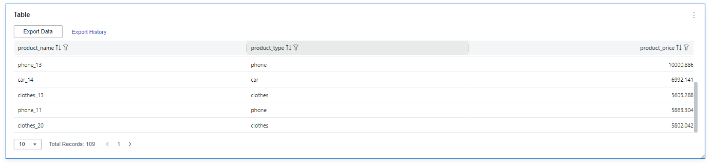
Figure 1 Table chart
- Click Save or Save and Publish in the upper right corner to save the table.Note
Click Save in the upper right corner. In the displayed dialog box, enter the dashboard name, and click Confirm. The saved dashboard cannot be viewed but can be deleted.
Click Save and Publish to save and publish the dashboard. You can view the saved dashboard. To delete the dashboard, you need to take it offline first.
- On the displayed dashboard page, enter a dashboard name. Click OK.
Field
- Set the column content.
- In the dimension list in the data column, select the field and double-click or drag it to the field column.
- In the metric list in the data column, select the field and double-click or drag it to the field column.
- Set the field display content.
Click
 in the column, select Field Display Content and click to modify the field display content on the displayed page. Click OK.
 - Set the drill-down.
Columns support the setting of field display content modification and drill-down functions for dimension fields.
NoteDrill-down function: When analyzing company sales data, you can change the analysis granularity by drilling down the data, such as drilling down from the regional granularity to the provincial granularity to view the data situation based on geographic dimensions. Connecting data from various dimensions facilitates data analysts to analyze the data and draw conclusions.
- Click the field (
 ) in the column and drag the field of the target location to be drilled down to the Drilldown area.
 - Click Update to test whether the drilldown function is set successfully.
- Click the field (
- Set the aggregation mode.
Columns support the setting of aggregation method and field display content for metric fields.
NoteAggregation method: Perform calculation and processing on data to make the analyzed data more orderly and intuitive.
Click
 of the field in the column, select Aggregation Method and click to support setting of no aggregation, sum, count, distinct count, maximum value, minimum value, average value, population standard deviation, sample standard deviation, sample variance, range start value, and range end value.
 - Set the field display content.
Click
 in the column, select Field Display Content and click to modify the field display content on the displayed page. Click OK.
- Set a filter.
- Drag dimension and metric fields to the Filter area.
- Click
 next to a field in the Filter area.
 - In the displayed Set Filter dialog box, set the parameters and click OK.
Table 1 Filter parameters Type
Parameter
Description
String
Condition
Filter Mode: The options are Condition and Enumeration.
Condition Type: The options are And condition and Or condition.
Filter Condition: The options are Exact match, Contain, Start with, End with, Not match, Not contain, Null, and Not null.
Enumeration
Query Mode: The options are Single-select and multi-select.
Filter Condition: The options are >, ≥, <, ≤, =, ≠, Null, and Not null.
Metric
Condition Type
The options are And condition and Or condition.
Filter Condition
The options are >, ≥, <, ≤, =, ≠, Null, and Not null. You can select Before aggregation and After aggregation for data.
NOTE:If you select Before aggregation, data is filtered before aggregation. If you select After aggregation, data is filtered after aggregation. For aggregation concepts, see Creating a Dataset.
You can click Create Filter Condition to set multiple filter criteria.
Date
Range value
Select a time range for filtering.
Single value
Set a single time for filtering.
Condition
You can select And condition or Or condition as the condition type and select filter condition like >, ≥, <, ≤, and =.
You can click Create Filter Condition to set multiple filter criteria.
- Set sorting.
- Drag and drop required data fields from the Dimension and Metric (Indicator) areas under Data to the Sorting area.
- Click
 next to a field in the Sorting area and select a sorting mode. The sorting modes are Ascending, Descending, and Custom.
 - To cancel sorting, click
 next to the sorting field.
- Set automatic refresh.
The auto refresh interval supports the following options: no refresh, 1 minute, 5 minutes, 15 minutes, and 30 minutes.
- Set the metadata mode.
The metadata mode can be set or not set. You can select or deselect this parameter.
NoteMetadata mode refers to the raw data that has not been processed by DataArts Insight.
Style
This part explains how to set table style parameters. For details, see Table 2.
Parameter | Description |
|---|---|
Card Title | Cards can be configured with or without a title. If a title is set, it will be displayed in the top left corner of the card. If the checkbox is not selected ( If the checkbox is selected ( |
Text | You can adjust the font size and color of the text. To change the font size, you can either type in the desired size or use the |
Alignment | You can align the text in the card to the left or center. |
Bottom Margin | Set the distance between the table title and the chart. To change the margin, you can either type in the desired margin or use the |
Divider | Cards can be configured with or without a divider line. If the checkbox is not selected ( If the checkbox is selected ( |
Card Background | Cards can be configured with or without a background. If the checkbox is not selected ( If the checkbox is selected ( |
Status Icon | You can customize the display style and color of the icon, which can be set to always show or show on hover. The card icon can be set to have a status or no status. If the checkbox is not selected ( If the checkbox is selected ( |
Column Width | You can either automatically set the table appearance or customize it. The column width can be set either by entering a specific value or using the |
Pagination | You can set the number of data pages displayed on the table, and this can be done within the table itself. The supported options for the number of pages are: 10, 20, 30, 50, 80, and 100. There are two display types: simple and regular. The simple type does not show page navigation. |
Set Header Alignment | You can set the alignment of table headers, which can be left-aligned, centered, or right-aligned. |
Functional Configuration | The following features can be configured: enabling quick filtering, specifying whether export is needed, and enabling multi-select operations. |
Series Settings | You can configure the alignment of table headers and column content independently.
|
Condition Format | Quick style.
|
Custom style:
|


Advanced
This part describes how to configure advanced functions of a table, including link and redirect.
- Link
Click the Advanced tab and click
 next to Linkage. The Chart Linkage Configuration page is displayed. Set parameters.
Table 3 Chart linkage settings Parameter
Description
Filter
Select the fields to be bound first and then select the chart to be associated with them. You can select all charts on the dashboard.
Associated Charts
Link the associated charts.
- Follow bound field: When the bound field is set to A, the associated data tables filter data related to A.
- SQL placeholder: The bound field value corresponds to the value set for the SQL placeholder in the dataset.
Click OK.
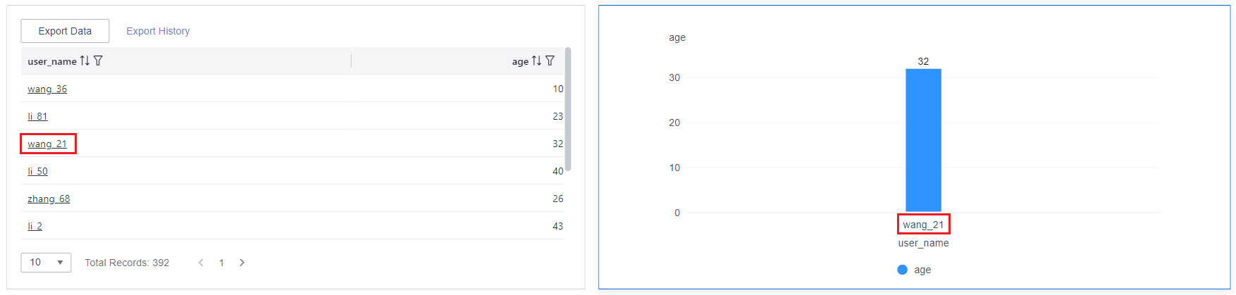
- Linkage example: Create a dataset using a store's sales data table.
- Create a table and a clustered column chart.
- Set user_name and age as column fields of the table.
- The dimension and measure fields of the clustered column chart are user_name and age, respectively.
- Associate the table with the cluster column chart.
- Click the Advanced tab and click
 next to Linkage. The Chart Linkage Settings page is displayed.
 - Bind the user_name field and associate the table with the clustered column chart. Set the bound field of the chart to Follow bound field.
- Click OK.
- Click the Advanced tab and click
- Click wang_21 in the user_name column of the table. Data related to wang_21 is displayed in the clustered column chart.
Figure 2 Data linkage result when selecting Follow bound field
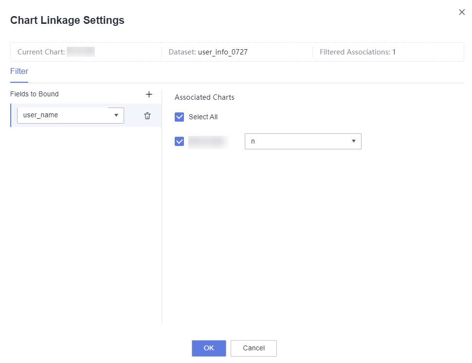
- Set the bound field of the associated chart to SQL placeholder.
- Set a SQL placeholder in the dataset.SELECT*FROMuser_infoWHEREuser_name not in (${n})
user_info indicates the data table name, and user_name indicates the bound field.
- Go to the Chart Linkage Settings page and set the bound field of the associated chart to SQL placeholder.
Figure 3 SQL placeholder
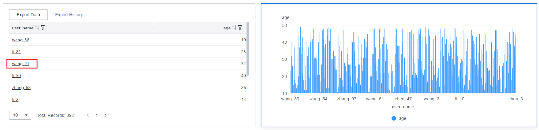
- Click zhang_87 in the user_name column of the table. Data except zhang_87 is displayed in the clustered column chart.
Figure 4 Data filtered when selecting SQL placeholder
- Set a SQL placeholder in the dataset.
- Create a table and a clustered column chart.
- Redirect
The text within the chart must have data before the redirect can be configured.
- Choose Advanced > Redirect. The Chart Redirect page is displayed. Set parameters.
- Select the fields to be bound and click OK.
Table 4 Chart redirect parameters Parameter
Description
Redirect Type
Redirection type. You can choose to redirect internally within the system or externally through a link.
Open Mode
You can choose to open it in the current window, a new window, or a popup window.
Redirect to Reports/Screens
You can select the project, dashboard, or large screen you want to redirect to.
NOTE:When Redirect Type is set to Intra-system redirect, Redirect to Reports/Screens can be selected.
URL
Enter the URL when you choose to redirect externally through a link.
NOTE:When filling out a URL, you need to ensure its security. If the URL is insecure, it may pose a security risk to your data. Be cautious when filling out the URL.
Associated Parameters
Parameters that take effect in the current report can be selected as associated fields or fixed values. Global parameters for Redirect to Reports/Screens can be selected only after global parameters are set.
Carry Condition
When Redirect Type is Intra-system redirect, multiple rows of fields and empty values can be carried (only can be set for table and dashboard). When Redirect Type is External link, empty values can be carried. Carrying null values is mainly used for filtering null values in data tables, making it easier for users to analyze data.
- Prerequisites: Set up two dashboards, A and B, with dashboard A linking to dashboard B.
- Procedure
- Configure global parameters in dashboard B and ensure that the same fields exist in dashboard A.
- Set the redirect parameters in dashboard A, select dashboard B as the target, and choose associated fields from the global variables.
- Select Carry null value and click OK.
- The bound field in dashboard A will be underlined. Click it to redirect to dashboard B and filter out rows with null fields. The URL of dashboard B will display the param parameter.
- Deselect Carry null value and click OK.
- The bound field in dashboard A will be underlined. Click it to redirect to dashboard B and display all chart data. The URL of dashboard B will not display the param parameter.
NOTE:If this option is selected and the chart allows for multiple data selections, the parameter carried will be an array containing the selected data.
- Initialize Query for Associated Query Control: whether the associated query control supports query initialization. If the checkbox is selected (
 ), the control supports query initialization. If the checkbox is not selected (
 ), the control does not support query initialization.Note
If you select this option, when a chart is linked to a query control and the query control does not have a default query set, the chart's data configuration will be queried during chart initialization.