You can use the query control to search and display the desired chart data on the dashboard. It supports searching for fields of date, text, and numeric types.
Prerequisites
A dashboard has been created by referring to Creating a Dashboard.
Procedure
- In the top navigation bar on the dashboard creation page, click
 to create a query control.
 - In the new query control, click
 to create a query condition.
 - Set query condition parameters.
Table 1 Query condition parameters Parameter
Description
Query Condition
Query condition name, which is displayed in the upper left corner of the control.
Condition Configuration
Set related parameters based on Table 2.
Associated Charts
Charts associated with the query condition.
Cascading Controls
When you set Display Type to Dropdown list, filtered data is displayed in this area.
To use the cascading feature of the query control, you need to establish a relationship between query condition A and query condition B. For example, if you select a province in query condition A, the city list in query condition B will only show the cities under the selected province. This requires configuring the association between query condition A and query condition B.
Table 2 Condition configuration parameters Parameter
Description
Set as Mandatory
If you select this parameter (
 ), the query will include the search criteria. If you do not select it (
 ), the search criteria will not be included.NOTE:
Condition A is marked with an asterisk (*) and is required, while condition B is optional and not marked with an asterisk (*).
When querying a table, if condition A is not set and you try to set condition B by clicking Query button in the lower right corner of the control, condition A will turn red and data filtering will not be possible. To avoid errors, you must set condition A first, then set condition B before clicking Query. This will display the query results in the associated chart.
Display Type
Filter criteria support the following display types: dropdown list, text condition box, numeric condition box, numeric range selection, date selection, time condition box, time range selection, condition radio button, and column selector.
NOTE:A placeholder is added for selecting a time range. You can select a parameter of the range type.
Value Source
Two methods are supported: automatic parsing and manual input. This parameter is available only when Display Type is set to Dropdown list.
Dataset Fields
When Display Type is Dropdown list, the fields need to be associated with the dataset fields.
Query Mode
The query mode can be single-select or multi-select. This parameter is available only when Display Type is set to Dropdown list.
Query Time
Click query time. This parameter is available only when Display Type is set to Dropdown list.
NOTE:Once the dataset fields are configured, you can then set default filter values, filtering, sorting, and enhanced search functions.
Default Prompt Text
Default text in the condition configuration box.
Set Default Filter Value
Default filter value for the text, which can be exact match, contains, does not contain, does not match, start with, empty, or not empty. For numeric range selectors, only a range of numbers can be set. For date selectors, both absolute and relative time can be set.
Filter Effect
This parameter is supported only when Display Type is set to Numeric condition box or Numeric range. There are two formats: Before aggregation and After aggregation.
Formatted Display
This parameter is supported only when Display Type is set to Numeric condition box or Numeric range. The default value is Automatic.
Date Type
This parameter can be set only when Display Type is set to Date. The options are Year, Quarter, Month, Week, and Day.
Time Type
This parameter can be set when Display Type is set to Time and Time Range is set to Year, Quarter, Month, Week, Day, Hour, Minute, or Second.
Condition Operator
This parameter can be set only when Display Type is set to Time. The options are <, ≤, >, ≥, and =.
Field Type
This parameter can be set when Display Type is set to Condition radio button. The value can be a numeric or text.
Filter Criteria
This parameter can be set when Display Type is set to Condition radio button. It can be set to <, ≤, >, ≥, =, or ≠ for numeric, and Exact match, Contains, Does not contain, Does not match, Start with, Empty, or Not empty for text.
- Set the style parameters of the query control based on Table 1.
Table 3 Query condition style parameters Parameter
Description
Card Title
Cards can be configured with or without a title. If a title is set, it will be displayed in the top left corner of the card.
If the checkbox is not selected (
 ), the card will have no title.
If the checkbox is selected (
 ), the card will have a title.
Text
You can adjust the font size and color of the text. To change the font size, you can either type in the desired size or use the
 and
and  buttons.
Alignment
You can align the text in the card to the left or center.
Bottom Margin
The bottom margin of the card title can be set from 0 to 32.
Divider
Cards can be configured with or without a divider line.
If the checkbox is not selected (
 ), the card will have no divider line.
If the checkbox is selected (
 ), the card will have a divider line. You can customize the style and bottom margin of the divider line. The style and bottom margin can be set by inputting values or using the
  and
and  buttons.
Card Background
Cards can be configured with or without a background.
If the checkbox is not selected (
 ), the card will have no background.
If the checkbox is selected (
 ), the card will have a background. The background color can be set.
Status Icon
You can customize the display style and color of the icon, which can be set to always show or show on hover. The card icon can be set to have a status or no status.
If the checkbox is not selected (
 ), the icon will have no status.
If the checkbox is selected (
 ), the icon will have a status.
Button Settings
Button Display: The buttons can display the following options: search, clear, and reset. You can select which buttons to display by checking the
 and
and  checkboxes.
Button Position: The button position can be either fixed in the bottom right corner or below the control.
 indicates that the option is selected, and
  indicates that the option is not selected.
Button Spacing: You can set the spacing between buttons by inputting values or using the
 and
and  buttons.
 Main Button Color: Set the color of the main button.
Main Button Border Color: Set the border color of the main button.
Main Button Text Color: Set the text color of the main button.
Control Appearance
Control Spacing: You can set the spacing between controls by inputting values or using the
and buttons.Control Rounded Corners: You can set the corner radius of the controls by inputting values or using the
and buttons.Field Label: You can set the position of the field label to either the left or top of the control.
Control Stroke: You can also customize the border color of the control by checking the corresponding checkbox. If the checkbox is selected (
 ), you can customize the border color. If the checkbox is not selected, you cannot customize the border color.
Control Filling: The control supports both colored and uncolored fill settings. If the checkbox is not selected (
 ), the control will be in the format without a color. If the checkbox is selected (
 ), the control will be in the format with a color.
Function Settings
Display the expand/collapse button: It can be set to default expand or default collapse.
User-defined filter item query template: After selecting the custom filter item template and publishing the report, the template can be added to the query control in view mode. This feature can be set by selecting or not selecting the checkbox. Selecting it (
 ) means that custom settings can be made, while not selecting it (
 ) means that custom settings cannot be made.
Default Query: After selecting it, the default value configured by the user will be queried by default.
- Click Save or Save and Publish in the upper right corner to save the dashboard composed of query controls.Note
The differences between Save and Save and Publish are as follows:
- Click Save in the upper right corner. In the displayed dialog box, enter the dashboard name, and click Confirm. The saved dashboard cannot be viewed but can be deleted.
- Click Save and Publish to save and publish the dashboard. You can view the saved dashboard. To delete the dashboard, you need to take it offline first.
- On the displayed dashboard page, enter a dashboard name.
Example Scenario
You can quickly query data in tables on a dashboard using a query control and implementing secondary filtering through cascading controls.
- Step 1: Create a Query Control
- In the top navigation bar on the dashboard creation page, click
 to create a query control.
 - In the new query control, click
 to create a query condition.
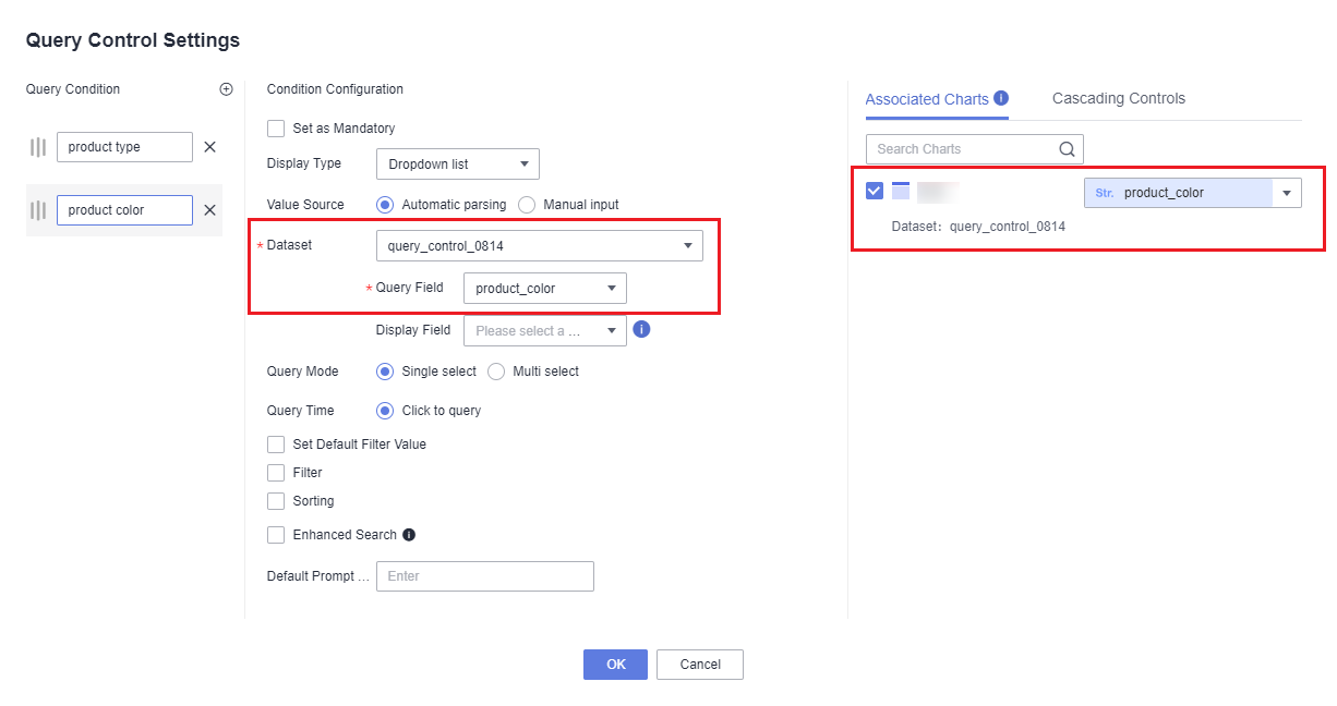
- Create a query control named product type. Specifically, in the displayed Query Control Settings dialog box, select a dataset and the query field in the Condition Configuration area and select the chart and field to be associated (product_type) on the Associated Charts tab on the right.
- Create a query control named product color. Specifically, in the displayed Query Control Settings dialog box, select a dataset and the query field in the Condition Configuration area, select the chart and field to be associated (product_color) on the Associated Charts tab on the right, and set the rest parameters the same as those set during the creation of the product type query control.
Figure 1 Query control settings
- In the top navigation bar on the dashboard creation page, click
- Step 2: Configure a Cascading Control
- Click

 in the upper right corner of the query control.
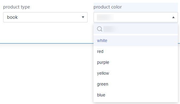
 - Configure a cascading control in the product type query control. Once configured, if you select book for the product type control, the product color control displays only the colors of books.
Figure 2 Configuring a cascading control
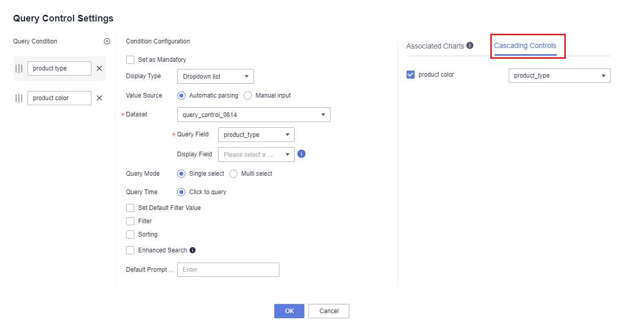
Figure 3 Cascading control effect
- Click
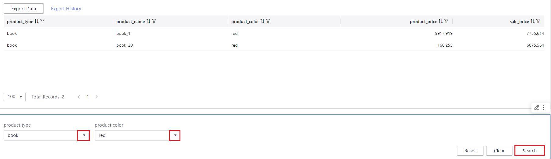
- Step 3: View Data on the Dashboard
- Select the product type to query in the product type control.
- Select the product color to query in the product color control.
- Click Search in the lower right corner of the page. The queried data is displayed in the table.
Figure 4 Query results