An indicator dashboard can display data in a clear and concise manner, allowing you to quickly grasp the current situation and make timely decisions to implement appropriate measures. Therefore, an indicator dashboard is one of the effective ways to discover and solve problems. This section will show you how to add data and configure styles for indicator dashboards.
Notes and Constraints
- The dimension axis is determined by the dimensions of the data and at least one dimension must be selected, such as date, province, or product type.
- The metric axis is determined by the metrics of the data and at least one metric must be selected, such as order quantity.
- The color legend is determined by the dimensions of the data and only one dimension can be selected.
Procedure
- In the top navigation bar on the dashboard creation page, click
 to create an indicator dashboard.
 - Select a dataset in the Data area.
- Set parameters on the Field, Style, and Advanced tabs.
- Click Update. The system automatically updates the chart.
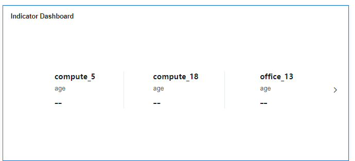
Figure 1 Indicator dashboard
Field
- Set fields.
- Find the data field you need in the dimension and metric lists within the data column.
- In the dimension list, double-click or drag and drop the product type and product name to the column.
- In the metric list, double-click or drag the product price to the column.
Columns support the setting of field display content modification and drill-down functions for dimension fields.
NoteDrill-down function: When analyzing company sales data, you can change the analysis granularity by drilling down the data, such as drilling down from the regional granularity to the provincial granularity to view the data situation based on geographic dimensions. Connecting data from various dimensions facilitates data analysts to analyze the data and draw conclusions.
- Set the field display content.
Click
 in the column, select Field Display Content and click to modify the field display content on the displayed page. Click OK.
 - Set the drill-down.
Click
 in the column.
Columns support the setting of aggregation method and field display content for metric fields.
NoteAggregation method: Perform calculation and processing on data to make the analyzed data more orderly and intuitive.
- Set the aggregation mode.
Click
 of the field in the column, select Aggregation Method and click to support setting of no aggregation, sum, count, distinct count, maximum value, minimum value, average value, population standard deviation, sample standard deviation, sample variance, range start value, and range end value.
 - Set the field display content.
Click
 in the column, select Field Display Content and click to modify the field display content on the displayed page. Click OK.
- Set a filter.
- Drag dimension and metric fields to the Filter area.
- Click
 next to a field in the Filter area.
 - In the displayed Set Filter dialog box, set the parameters and click OK.
Table 1 Filter parameters Type
Parameter
Description
String
Condition
Filter Mode: The options are Condition and Enumeration.
Condition Type: The options are And condition and Or condition.
Filter Condition: The options are Exact match, Contain, Start with, End with, Not match, Not contain, Null, and Not null.
Enumeration
Query Mode: The options are Single-select and multi-select.
Filter Condition: The options are >, ≥, <, ≤, =, ≠, Null, and Not null.
Metric
Condition Type
The options are And condition and Or condition.
Filter Condition
The options are >, ≥, <, ≤, =, ≠, Null, and Not null. You can select Before aggregation and After aggregation for data.
NOTE:If you select Before aggregation, data is filtered before aggregation. If you select After aggregation, data is filtered after aggregation. For aggregation concepts, see Creating a Dataset.
You can click Create Filter Condition to set multiple filter criteria.
Date
Range value
Select a time range for filtering.
Single value
Set a single time for filtering.
Condition
You can select And condition or Or condition as the condition type and select filter condition like >, ≥, <, ≤, and =.
You can click Create Filter Condition to set multiple filter criteria.
- Set sorting and find the data field you need in the dimension and metric lists within the data column.
In the dimension list, drag and drop the product type and product name to the Filter area.
In the metric list, drag and drop the product price to the Filter area.
- Set sorting.
Click
 of the sorting field and choose the desired order. The following sorting settings are supported: no sorting, ascending, descending, and custom. You can also click the no sorting icon (
 ), ascending icon (
 ), or descending icon (
 ) in the intelligent chart.
- Set sorting.
- Set the maximum number of query results.
Enter the maximum number of records that can be returned in the text box. The default value is 1000.
- Set automatic refresh.
The auto refresh interval supports the following options: no refresh, 1 minute, 5 minutes, 15 minutes, and 30 minutes.
- Find the data field you need in the dimension and metric lists within the data column.
Style
- Set the style.
Set the style parameters of an indicator dashboard.
Table 2 Table style parameters Parameter
Description
Card Title
Cards can be configured with or without a title. If a title is set, it will be displayed in the top left corner of the card.
If the checkbox is not selected (
 ), the card will have no title.
If the checkbox is selected (
 ), the card will have a title.
Text
You can adjust the font size and color of the text. To change the font size, you can either type in the desired size or use the
 and
and  buttons.NOTE:
Note that the input cannot be empty and must be from 14 to 32.
Alignment
You can align the text in the card to the left or center.
Bottom Margin
Set the distance between the indicator dashboard title and the chart. To change the margin, you can either type in the desired margin or use the
and buttons.NOTE:Note that the input cannot be empty and must be from 0 to 32.
Divider
Cards can be configured with or without a divider line.
If the checkbox is not selected (
 ), the card will have no divider line.
If the checkbox is selected (
 ), the card will have a divider line. You can customize the style and bottom margin of the divider line. The style and bottom margin can be set by inputting values or using the
  and
and  buttons.NOTE:
Note that the input for the style cannot be empty and must be from 0 to 8. The bottom margin can only be set after the style has been set, and the input cannot be empty and must be from 0 to 32.
Card Background
Cards can be configured with or without a background.
If the checkbox is not selected (
 ), the card will have no background.
If the checkbox is selected (
 ), the card will have a background. The background color can be set.
Status Icon
You can customize the display style and color of the icon, which can be set to always show or show on hover. The card icon can be set to have a status or no status.
If the checkbox is not selected (
 ), the icon will have no status.
If the checkbox is selected (
 ), the icon will have a status.
Table 3 Style configuration — Indicator content Parameter
Description
Indicator Relationship
Set the relationship between indicators as parallel or primary-secondary.
Indicator Location
You can choose to align indicators to the left or center.
Content Alignment Mode
You can choose to align content to the left or center.
Show Dimension Name
You can choose whether to display the name of the dimension in the indicator dashboard.
Display Main Indicator Name
You can choose whether to display the name of the main indicator in the indicator dashboard.
When enabled, you can customize the name, position, font size, and color of the indicators. You can also set the font size and color of the main indicator value.
Secondary Indicator
Set the font size and color of the secondary indicator text.
Indicator Unit
Set the position, name, font size, and color of the indicator unit.
Table 4 Style configuration — Indicator layout Parameter
Description
Indicator Display Mode
You can choose between sliding indicators left and right or displaying them in a wrap format.
Maximum Records in Each Line
You can choose how many indicator blocks to display per row on your indicator dashboard.
Indicator Separation
You can choose to have dividers between your indicators or not.
Table 5 Series settings Parameter
Description
Context
Set the context for the series, supporting Simplified Chinese and English.
Unit
Units support automatic, none, hundred, thousand, ten thousand, hundred million, ten billion, and trillion.
Scientific Notation
Support the use of scientific notation.
Use thousands separator
Whether or not to use thousands separators.
Decimal Places
Whether or not to support decimal places.
Condition Format: This function is not enabled currently.
Advanced
- Linkage
Click the Advanced tab and click
 next to Linkage. The Chart Linkage Settings page is displayed. Set parameters. For details, see Linkage example.
Table 6 Chart linkage configurations Parameter
Description
Filter
Select the fields to be bound first and then select the chart to be associated with them. You can select all charts on the dashboard.
Associated Charts
Link the associated charts.
- Follow bound field: When the bound field is set to A, the associated data tables filter data related to A.
- SQL placeholder: The bound field value corresponds to the value set for the SQL placeholder in the dataset.
- Initialize Query for Associated Query Control: whether the associated query control supports query initialization. If the checkbox is selected (
 ), the control supports query initialization. If the checkbox is not selected (
 ), the control does not support query initialization.Note
If you select this option, when a chart is linked to a query control and the query control does not have a default query set, the chart's data configuration will be queried during chart initialization.